PORTFOLIO
Joint Mechanics

Clean, User-Friendly Website Design
We redesigned the site with a calm, modern look that immediately communicates trust and professionalism. The new layout features clearer service descriptions, improved navigation, and easier access to key information.
Because Howard wanted clients to book appointments effortlessly, we integrated a new booking system that lets people schedule and pay online. To build trust and increase conversions, I added a reviews app that automatically displays customer testimonials on the homepage.
We also added more prominent calls-to-action throughout the site and refined the navigation so visitors can find what they need in just a few clicks. Clear calls-to-action, detailed service descriptions, and practitioner profiles all work together to inform clients and build confidence.
Improved Customer Journey
Howard runs Joint Mechanics, a well-established osteopathy and multidisciplinary health clinic in Ashtead. His practice was thriving through word of mouth, but his website wasn't doing his expertise justice. It felt outdated and made it harder than it should be for potential clients to understand his services or book appointments.
He needed a website that reflected the professionalism of his clinic and made it genuinely easy for people to find what they needed—whether that was learning about treatments, meeting the practitioners, or booking their first appointment.
The Result
Howard now has a website that supports his business rather than holding it back—a clean, professional platform that makes it simple for clients to learn about services, meet the team, and book appointments online. The site performs better, loads faster, and most importantly, gives his clients the supportive experience they deserve from their very first click.
Scales and Tales
The Result
Kelly runs Scales and Tales, a busy performing arts school with classes running across multiple schools throughout the week. Parents were constantly trying to navigate a high volume of offerings, different schools, age groups, activity types and it was overwhelming. Kelly needed a website that would make it genuinely easy for time-poor parents to find the right class for their child and book with confidence.
The old site wasn't doing that. It felt cluttered and stressful when it should have felt welcoming and exciting.
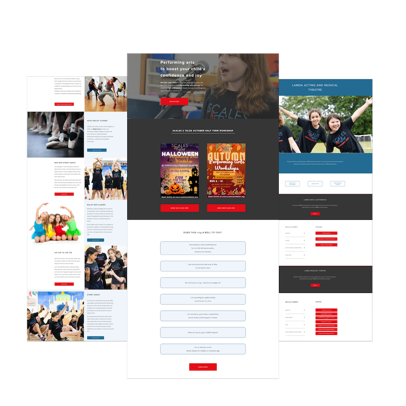
What we created together
We built a new Squarespace website designed around one goal: making busy parents' lives easier.
I created a clear, intuitive navigation system that lets users filter by school, age group, or activity type so parents can find exactly what they need in just a few clicks, without unnecessary overwhelm. The overall design reflects the inclusive, creative spirit of Scales & Tales while keeping the user journey smooth and efficient.
For time-poor parents, a streamlined booking process was essential. We enhanced the integration with MagicBooking and placed clear calls-to-action throughout the site, making it simple to register and pay for classes in just a few steps.
To help build trust with new families, we included genuine parent testimonials and used real photography to show the joy and creativity happening in the sessions. These touches don't just improve usability, they create a sense of professionalism and reassurance, encouraging new families to get involved with confidence.
The result
For time-poor parents, a streamlined booking process was essential. We enhanced the integration with MagicBooking and placed clear calls-to-action across the site, making it simple to register and pay for classes in just a few steps. To help build trust with new families, we included genuine parent testimonials and used real photography to show the joy and creativity in the sessions. These updates not only improve usability but also create a sense of professionalism and reassurance, encouraging new families to get involved with confidence.
-
![]()
“Emily has incredible vision and creativity and this was a must for our business. I could not be without her expertise, willingness to help and calm natured attitude.”
KELLY HART- SCALES & TALES
-
![]()
“Emily has calmly, professionally and expertly listened to what I wanted and designed and delivered a lovely new website that is easy to navigate and looks great. Can't rate her services highly enough. ”
HOWARD GILBERT - JOINT MECHANICS